Project Objective
The objective of this project was to record both quantitative and qualitative data over a period of two weeks and display it in a visually appealing way that highlights the patterns and correlations in the data.
Data Collection
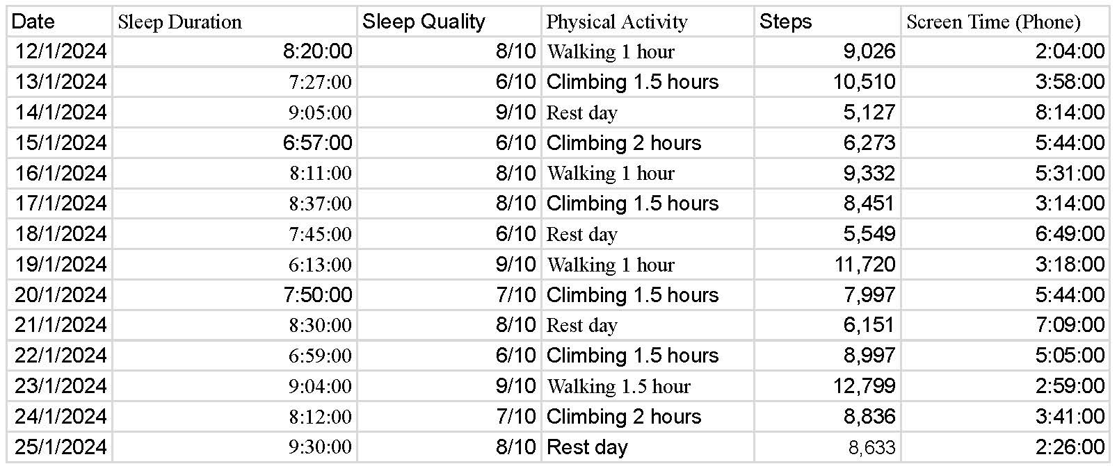
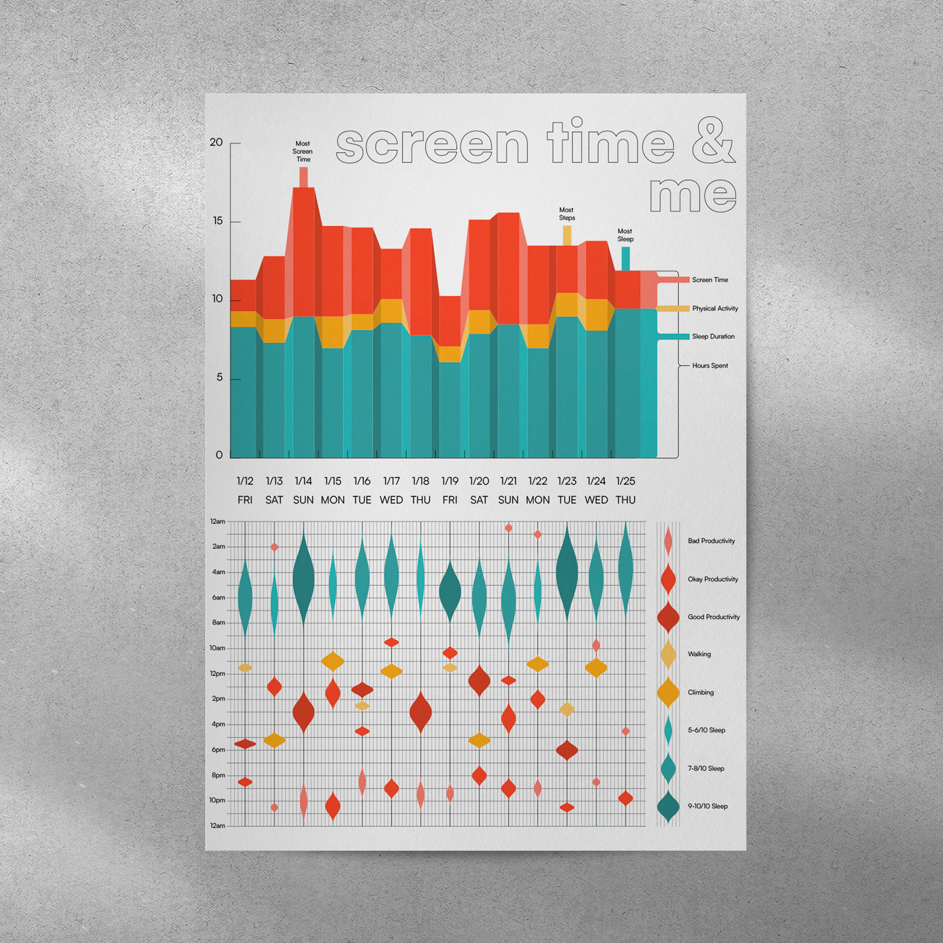
For this project I collected data about my sleep, physical activity, and screen time. For all three of these i utilized built in features to track the qualitative data more accurately; I used my apple watch for sleep time and a step counter, and consulted the screen time tracker on my iPhone. I collected the qualitative data immediately after the activity in order to ensure its accuracy. For example, i would rate my quality of sleep right after waking up.
Data analysis & sketches
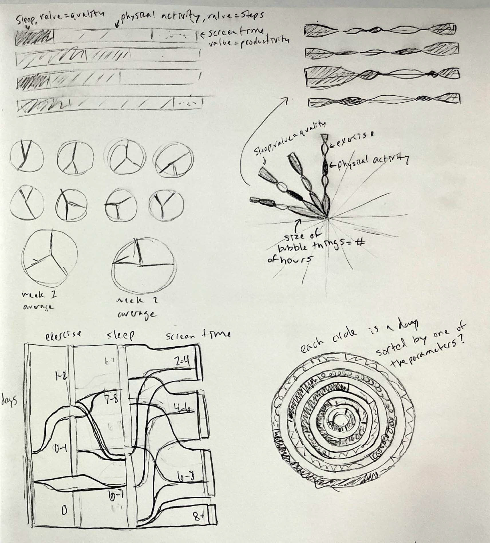
I noticed a correlation in the data: days with more physical activity had less screen time, and the following night would have a better quality of sleep. Because of this, i centered my ideation sketches around the idea of highlighting that correlation. i focused on designs that could compare the length of exercise, sleep, and screen time directly and include the qualitative data as an added layer of depth.
Production
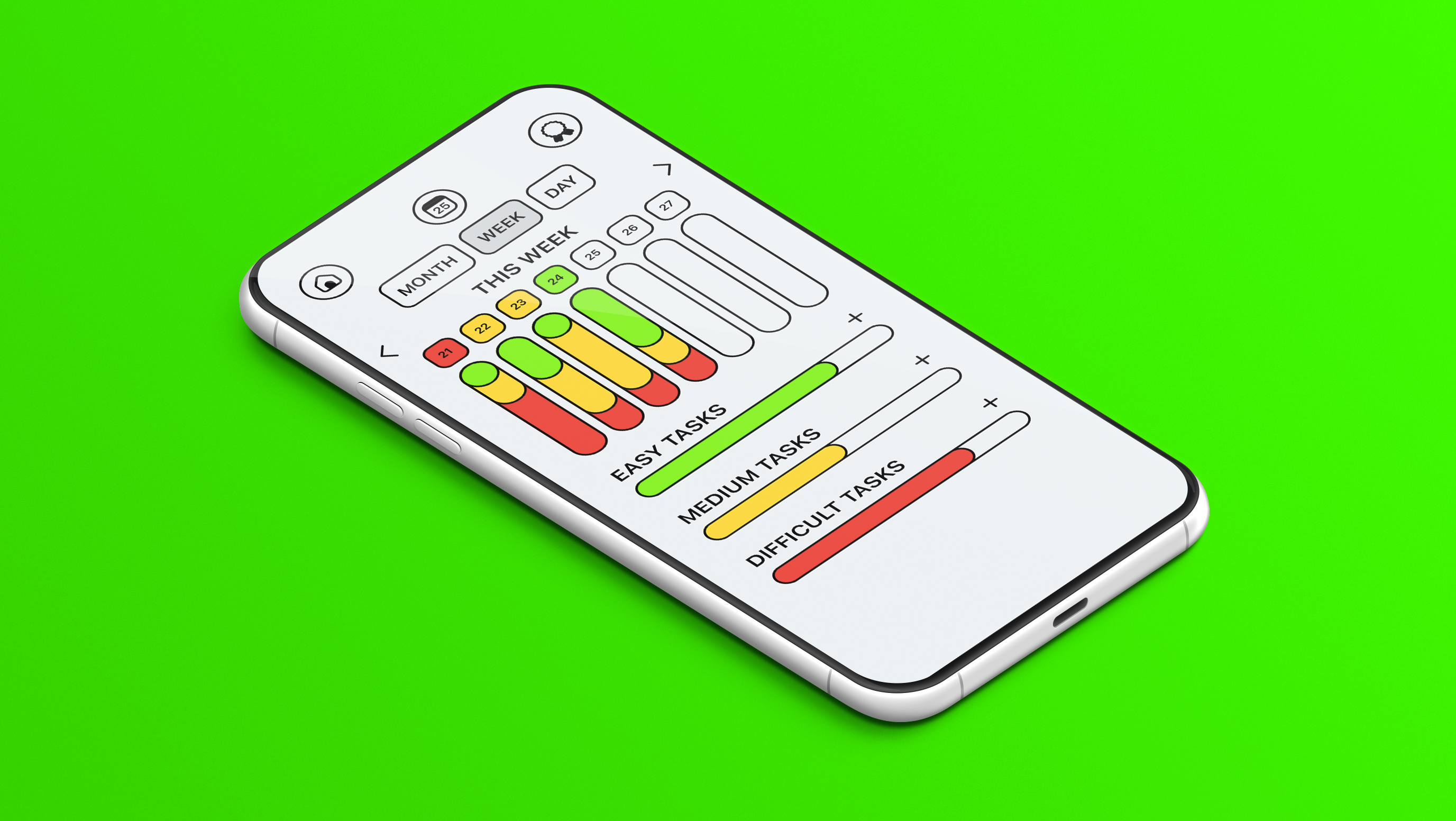
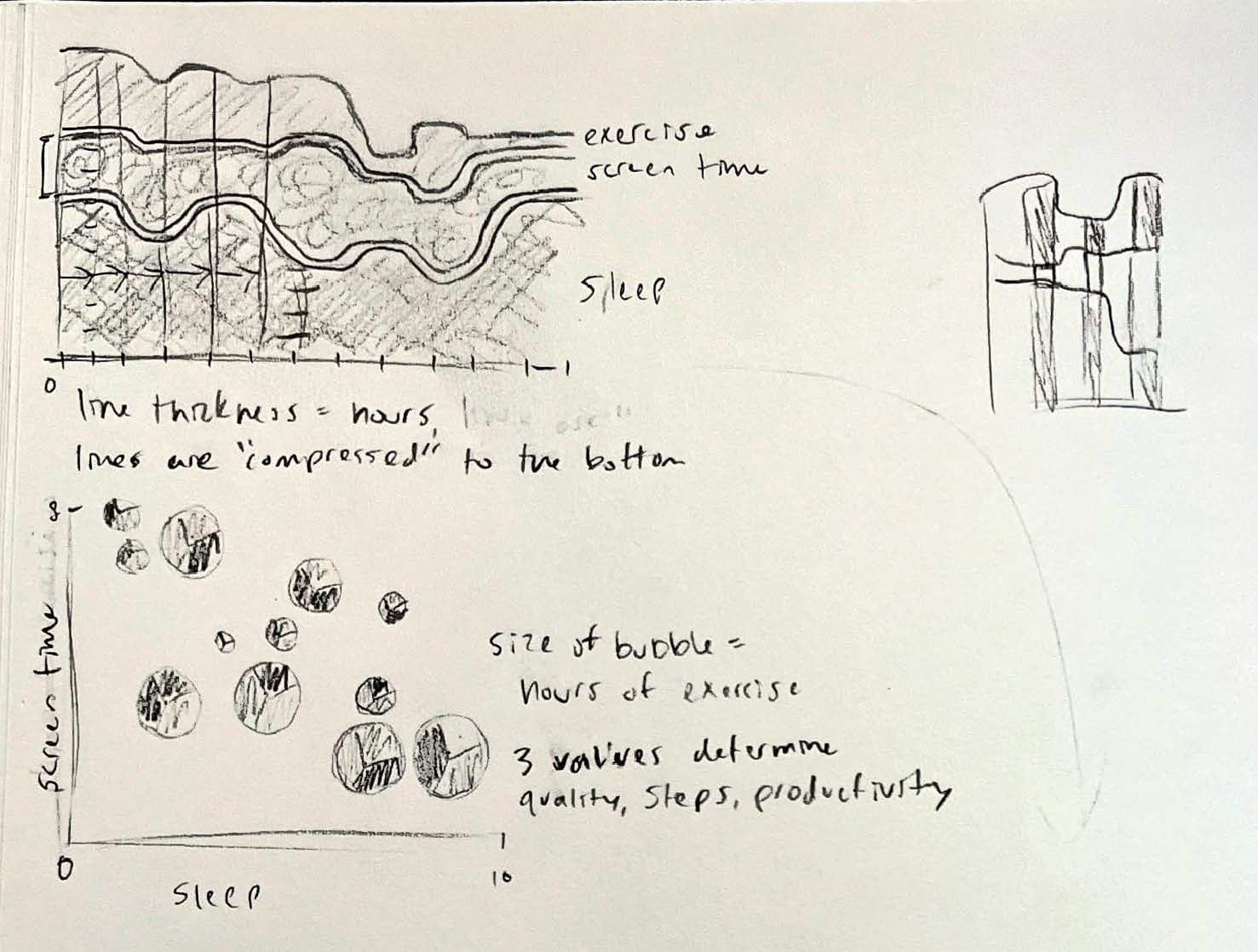
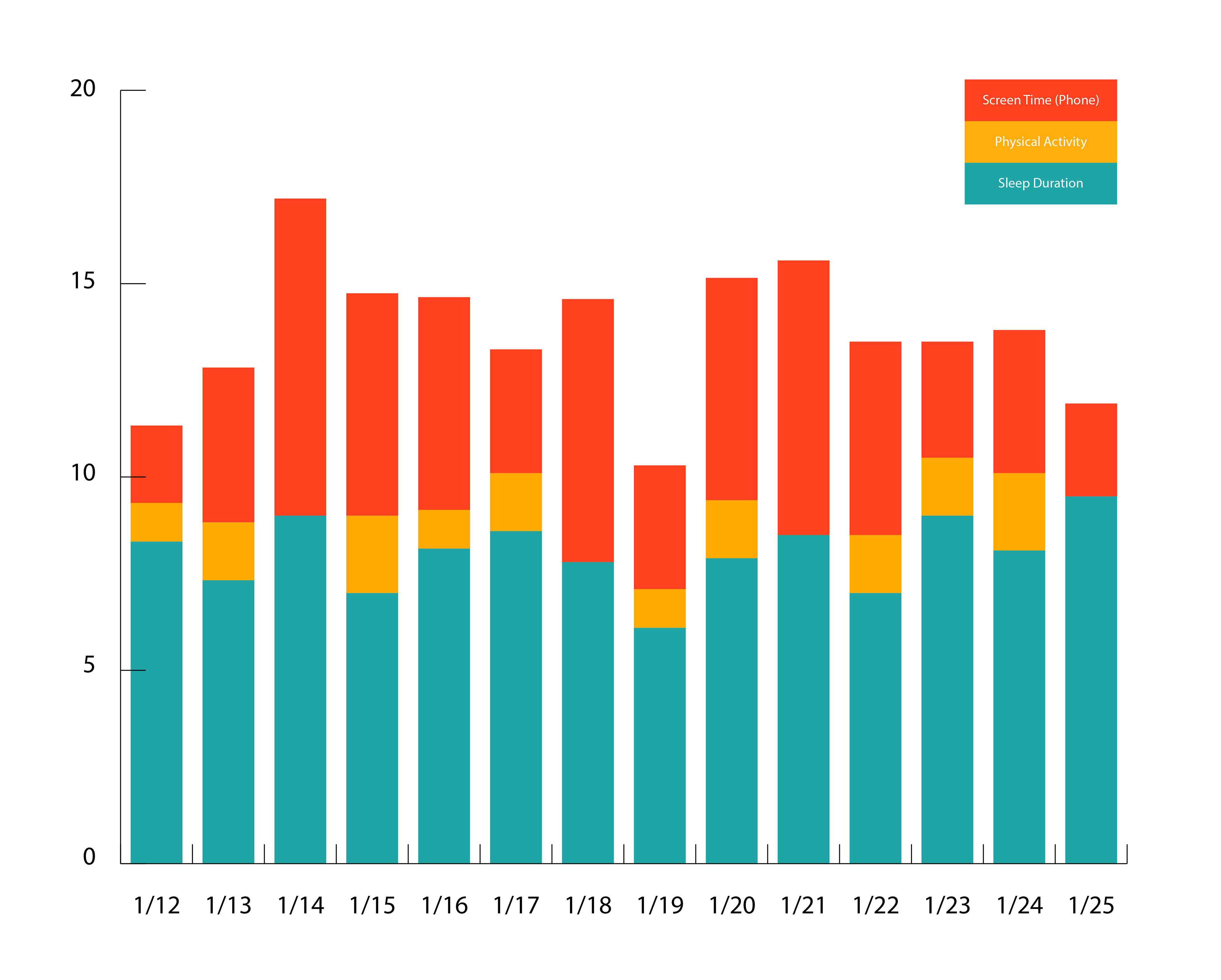
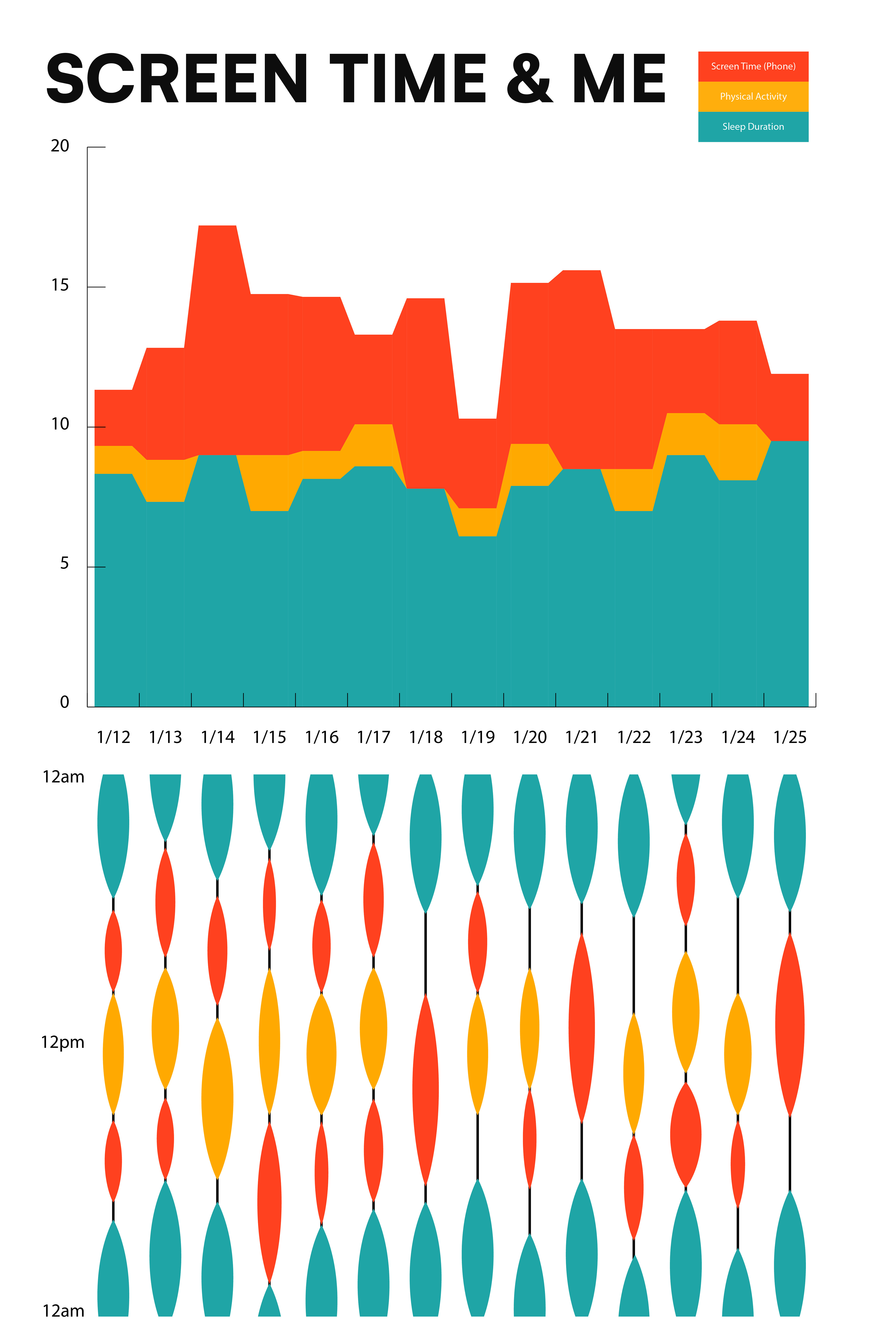
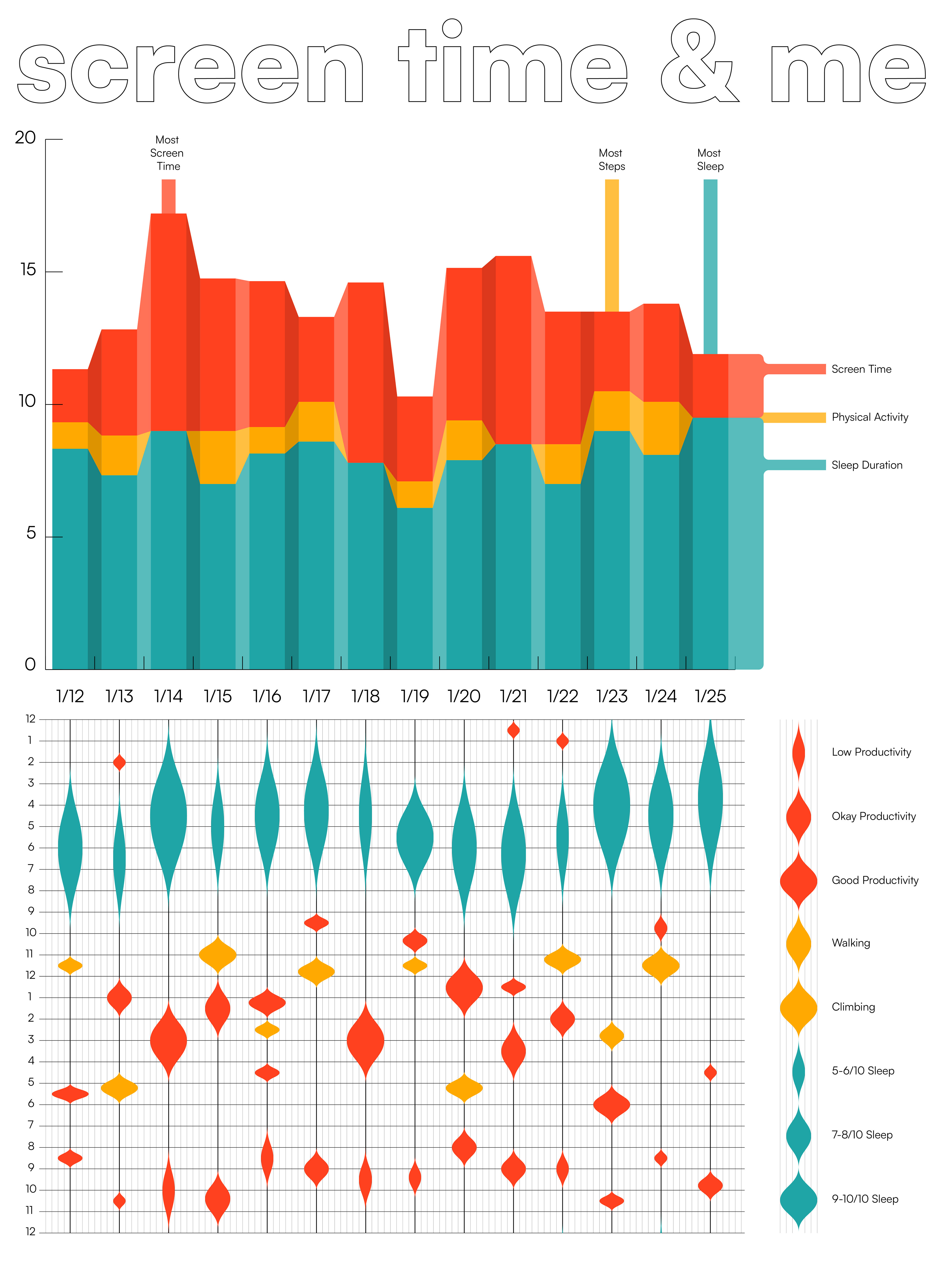
For the first iteration of the final design, i chose a stacked bar graph to directly compare the 3 activities for each day, as well as compare the days as a whole. For the second iteration, i added a transition between the days to better show the passage of time, as well as to make the data more visually appealing. I also added a 24-hour timeline below each day to better show my daily habits. I next fleshed out the 24-hour timeline to include the qualitative information as the thickness of the blocks of time. Finally I included an updated key along the right side, and added labels on the days with the most time in each data point.
Final Design
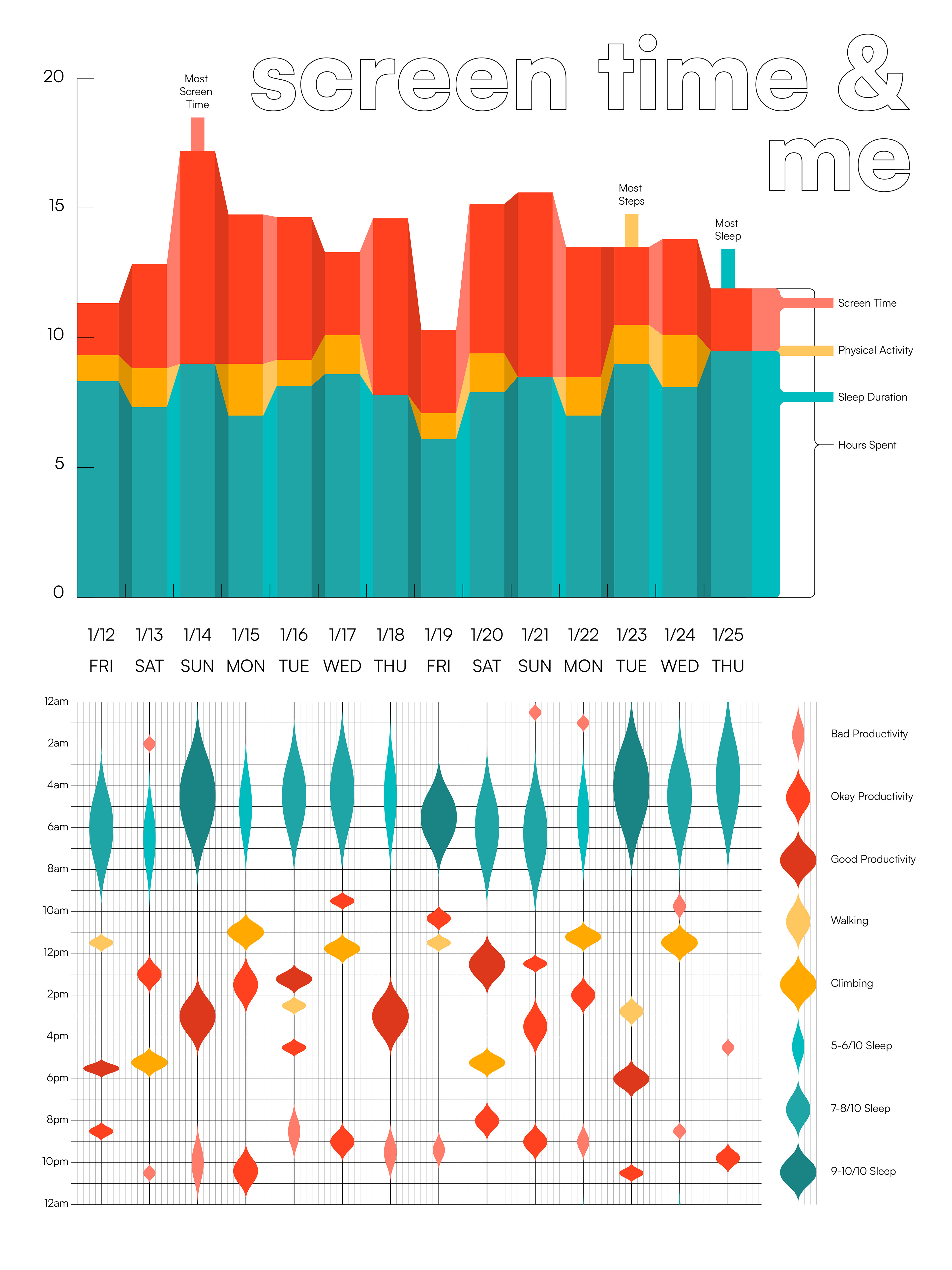
I found that the 24-hour timeline was difficult to read, especially in respect to the thickness of the lines that represented the qualitative data. Because of this, i chose to vary both the thickness and value of the lines to better differentiate them. finally, i added the days of the week below the date to give more context to the patterns and variations that can be found in the data. As a last touch i also slightly updated the layout of the poster.
Reflection
The most difficult part of this process, which is also where i learned the most, was the ideation sketching. creating unique ideas that conveyed my data in a complete and easily understandable way took time. I found that i was frequently thinking of designs that looked good but fell short on communicating data in the right way. Through this struggle i found that i have greatly improved in my ability to find the best data visualization methods for a given data set and combine them in a visually interesting way. If given more time, i would experiment with more visual styles (illustration, realism, abstract, 3d) to see if the data fit more in a different context.